Research. Psychology. Design Systems.
SoCap: A live
networking tool
Many people believe that networking is an essential tool for climbing the career ladder; however, interviews with event attendees revealed that networking is often awkward and undesirable. SoCap is based on the principle of social capital which relies on the value of interpersonal relationships and shared interests of a functioning social group as well as many other factors. Engaging in a shared activity together lends itself to greater interdependence and strengthens communities. We developed a tool for attendees to connect with others and strengthen their network in a fun and easy way.
Themes
1
Networking
fills jobs
2
"Networking
sucks"
3
Connections
don't last
4
Shared
activities key
My Role
As the sole contributing designer and as someone who thrives on collaboration and feedback, I found it crucial to utilize the team for revisions during the iterative process to ensure the end user's needs were met across all touch points. A substantive amount of competitive research and interviews had already been conducted, and the clean design slate made it a fun and challenging project to bring to life.
Establishing Empathy
Our target persona was developed to facilitate discussions about our users needs, desires and varying contexts of use. Through careful analysis of user interviews in combination with competitive analyses, we identified important differentiating variables. Overwhelmingly, young adults reported that networking is an unpleasant, yet necessary step in furthering your professional development. Additionally, the main driving motivators for attending network events is to gain employment or plant the seed for future professional ventures.


Similarity Matrix. Utilizing Optimal Workshop, I conducted a card sorting study to evaluate how users would expect content to be organized in our app. The strength of relations helped influence our IA. Darker colors and numbers reaching 100 indicate common responding among users. You can quickly identify groups of tasks by scanning these clusters reflecting expected mental models of users. Items that are unrelated may not necessarily have to live in a separate layer, but knowing how users organize content is helpful for beginning the IA and providing visual cues for common features.


Dendrogram. Due to a small sample size (10 participants), the best merge method was also used to simplify similarities in content structure among users. The proportion of participant agreement with particular card groupings is visualized with each branch and simplified to smaller and smaller groups of tasks. The final convergences fell across 4 main categories
Profile
-
Log out of the app
-
Change your password
-
Upload a photo of yourself
-
Access your personal information
-
Edit your personal information
Events
-
Find upcoming happenings and save
-
Check into a live event
-
Leave an event
-
View coordinator information
-
View summary of statistics for group
Connection
-
Begin a guided conversation
-
Select a discussion topic
-
Get connected with a partner
Follow a prompt to ask a person a question -
Skip a question
-
Finish a question
-
Finish a conversation
History
-
View a list of people you talked to at an event
-
See topics you talked about at previous events
-
View a history of previously attended occasions

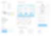
Starting with rough white board sketches of features reflecting the user content organization, I began mocking up the initial wireframes of key screens to gather feedback from the team and begin refining the user flow.


Brand Personality Explorations
Before moving onto higher fidelity screens I wanted to start defining our brand personality and presented a collection of mood boards that would help drive our palette and illustration style. We wanted to create an experience that communicated approachability and clarity. Cooler colors are more associated with feelings of being calm, which we wanted to leverage for social situations that may increase anxiety. The goal of the UX/UI was to put the user at ease and let the app do the heavy lifting until the anxiety fades and the connection has been established. We didn't want people to stay glued to their phones during a conversation, so we also aimed to make the design as minimal and distraction-free as possible. The 4th board was our starting point, which we later refined.


Once the team landed on an agreed brand direction, I increased the fidelity and iterated with their feedback
There were several rounds of review and iteration that incorporated evaluations of project scope, feedback, user needs, technical requirements, and timing. Towards the end of the iterations, I applied branding and updated assets to reflect a more consistent style across the user experience.


A design system built with engineers in mind
Although this project started with just 1 designer (yours truly), I wanted to ensure that future designers would be able to easily understand the style guidelines and easily pick up where I left off with minimal onboarding. It was also important to provide engineers with a design-hand off that was clear and easy. There were several rounds of review and iteration that incorporated evaluations of project scope, feedback, user needs, technical requirements, and timing. Towards the end of the iterations, I applied branding and updated assets to reflect a more consistent style across the user experience.

Card
Specifications
The goal of the UI was to use repeatable elements throughout the experience; therefore, the hand off to the front end developer played a crucial role in creating consistency in the experience. I utilized a mark up plugin for Sketch to make clear rules around padding for each card and row element.

Inputs and Other Elements
Variations in styling may become common over time as multiple developers and/or designers share and implement designs. Therefore, references for colors, font styles, forms and buttons were an essential foundation of the app.

Typography
Guidelines
In addition to the basic components of the style guide, there was a need to communicate typography styles to make the hierarchy clear and increase scan-ability and comprehension.
The final design reflects a cohesive system of user's expectations, branding identity, and consistent components. The UI was simplified down to focus on the core value of the app - connecting with others during live events to increase social capital and strengthen networking ties post events.

Lessons Learned
Creating a brand image from scratch is no small task, let alone a new product in a niche area with few competitor references. I aimed to provide low fidelity wireframes for feedback from the team, but missed opportunities to do the same with potential users. We moved forward with branding applications, which could present issues with style bias. On a positive note, organizers responded enthusiastically to the value proposition of our app in hopes that it will increase engagement for their event attendees and are testing out the experience for themselves.